In the competitive world of business, establishing a strong brand identity is essential for success. While many elements contribute to a brand’s visual identity, color plays a significant role in creating an immediate and lasting impression. The colors you choose for your brand or logo can evoke specific emotions, influence consumer perceptions, and ultimately impact your brand’s success. In this blog post, we’ll delve into the fascinating world of color psychology and guide you on how to select the perfect color palette for your new brand or logo.
Understanding Color Psychology:
Color psychology is the study of how different colors affect human behavior and emotions. Each color has its own unique psychological associations and can elicit specific responses from individuals. By leveraging the principles of color psychology, you can strategically align your brand’s identity with the emotions and values you want to evoke in your target audience.
Red: Passion, Energy, and Urgency
Red is a bold, attention-grabbing color that symbolizes passion, energy, and urgency. It can evoke excitement, stimulate appetite, and create a sense of urgency. Brands like Coca-Cola and YouTube utilize red in their logos to captivate attention and create a sense of vitality.
Blue: Trust, Security, and Reliability
Blue is often associated with trust, security, and reliability. It is a calming color that instills a sense of peace and stability. Many financial institutions and technology companies, such as PayPal and IBM, incorporate blue into their branding to establish credibility and convey a sense of professionalism.

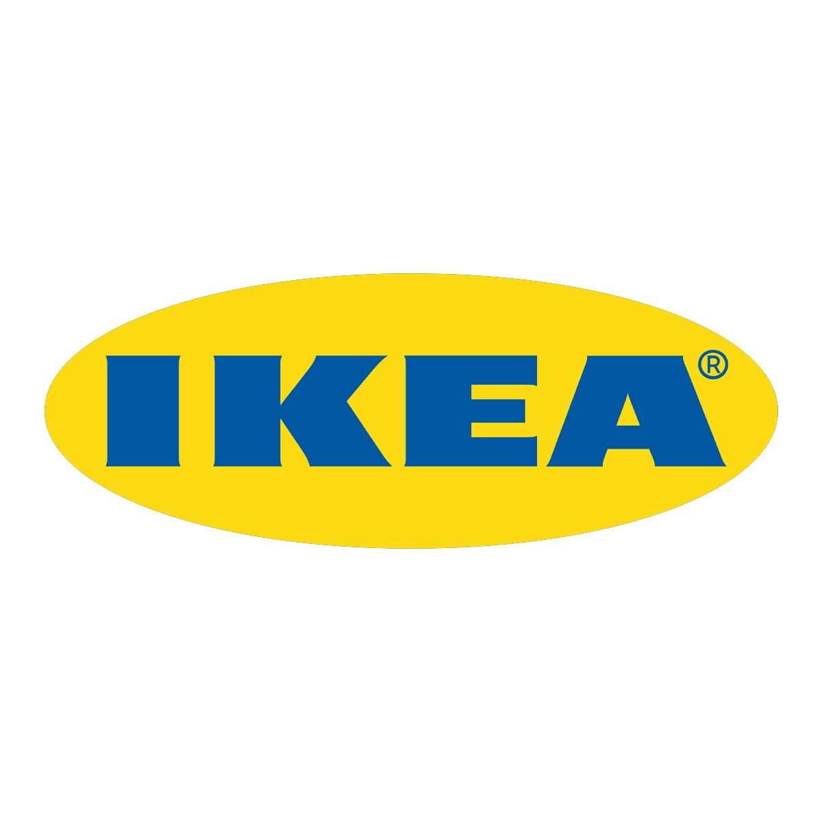
Yellow: Optimism, Warmth, and Happiness
Yellow is a vibrant color that evokes feelings of optimism, warmth, and happiness. It grabs attention, stimulates mental activity, and can create a sense of cheerfulness. Brands like McDonald’s and IKEA use yellow to convey a sense of joy and positivity.
Green: Growth, Nature, and Health
Green is associated with nature, growth, and health. It represents harmony, freshness, and balance. Brands in the organic, environmental, and health industries, like Whole Foods and Animal Planet, use green to connect with their audience and communicate a commitment to sustainability.


Purple: Creativity, Luxury, and Royalty
Purple is often associated with creativity, luxury, and royalty. It has a sense of mystique and sophistication, making it a popular choice for brands seeking to convey elegance and exclusivity. Companies like Cadbury and Hallmark use purple to add a touch of opulence to their brand identities.

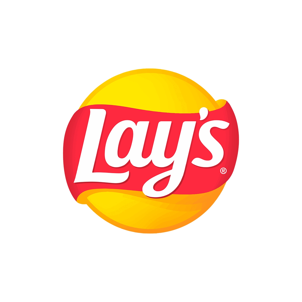
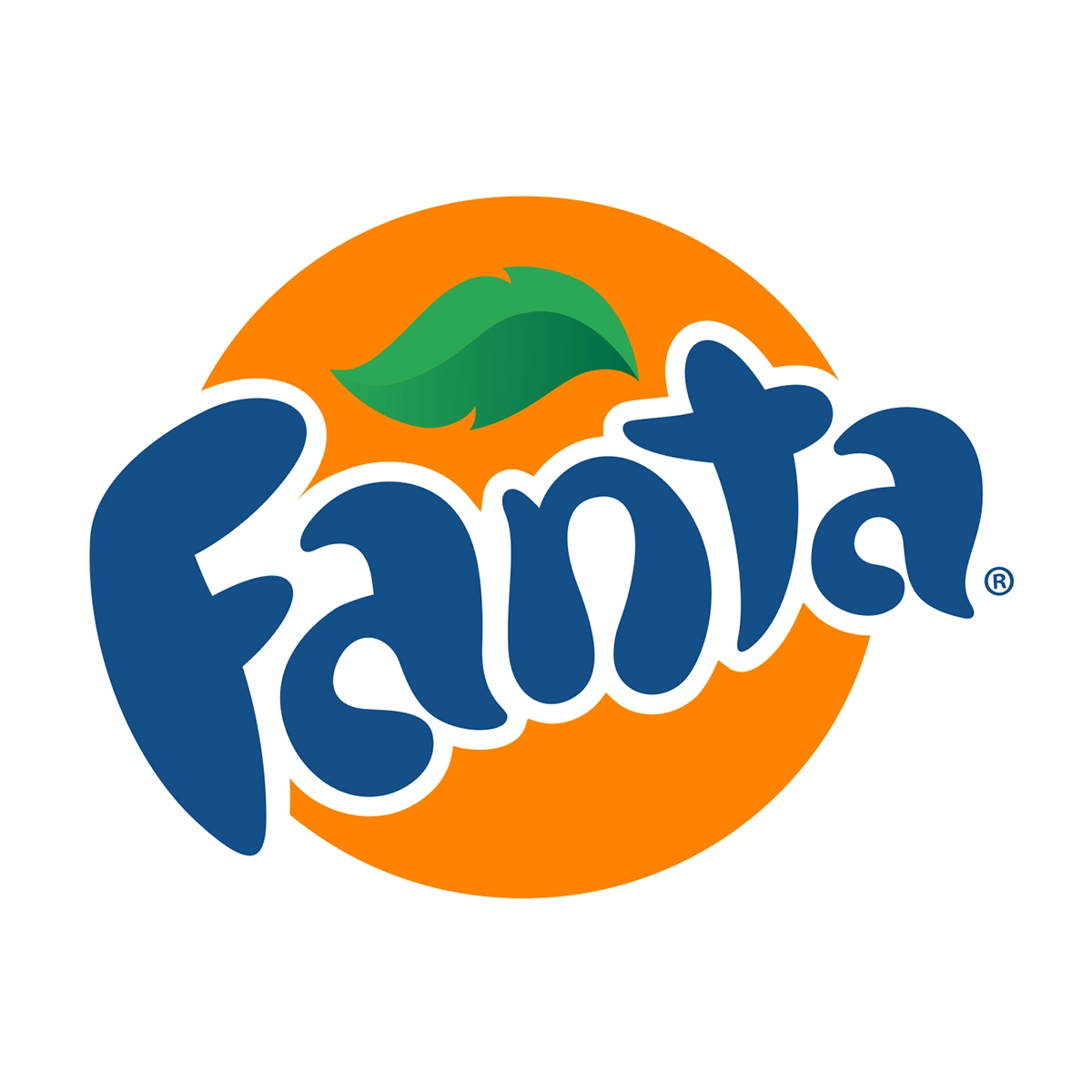
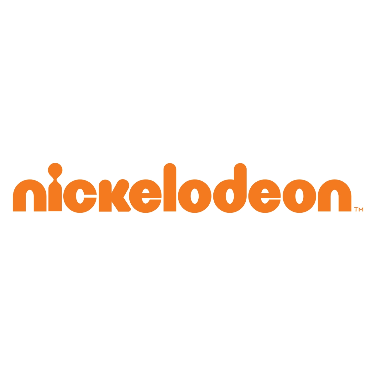
Orange: Energy, Playfulness, and Enthusiasm
Orange is a vibrant and energetic color that exudes playfulness and enthusiasm. It can evoke feelings of excitement and creativity. Brands like Nickelodeon and Fanta incorporate orange into their logos to appeal to a youthful and energetic audience.


Choosing the right colors for your brand or logo involves careful consideration of color psychology and the emotional responses they elicit. By aligning your brand’s identity with the desired emotions and values, you can establish a strong and memorable brand presence. Remember, colors alone won’t guarantee success, but a thoughtful selection that resonates with your target audience can significantly enhance your brand’s impact. So, explore the fascinating world of color psychology, experiment with different palettes, and let your brand’s true colors shine